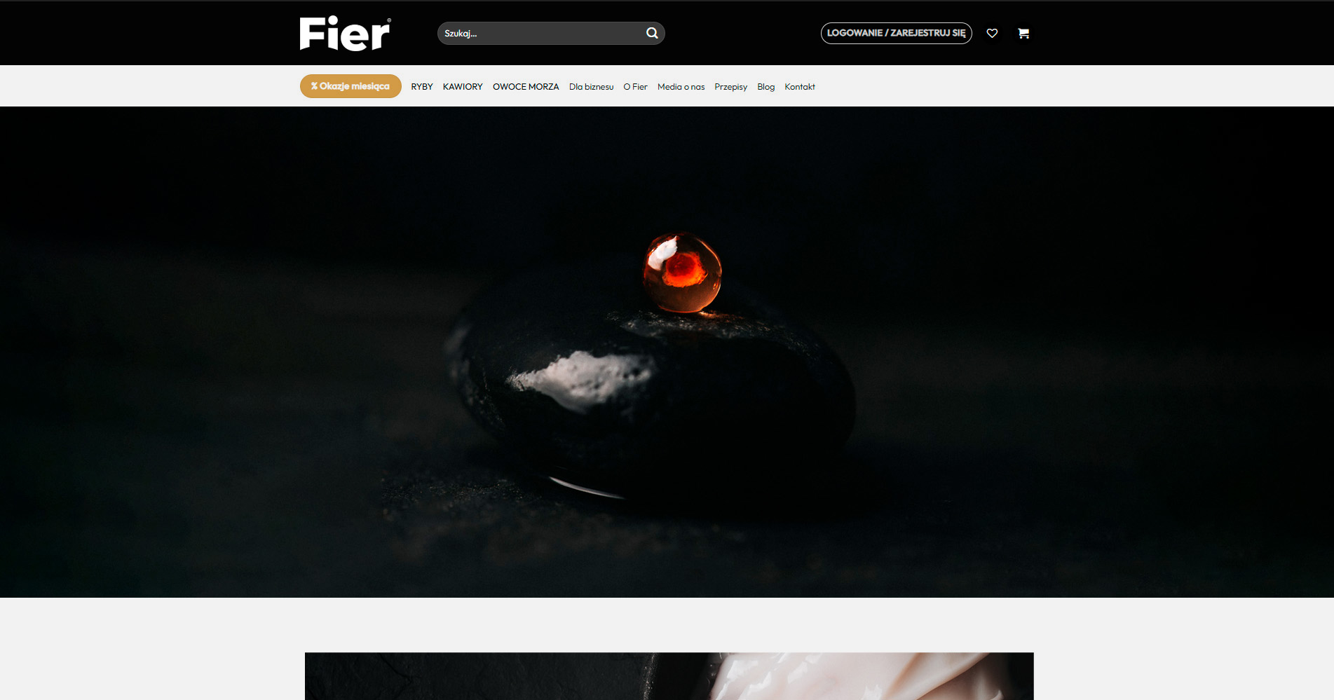
FIER SEAFOOD


Luxury Often Lives in Restraint
During the creation of Fier Seafood — a new premium seafood brand — I was approached by Nakatomi Agency to develop the photographic direction for the launch.
Nakatomi Agency provided the initial strategic and aesthetic direction for the brand, while the photographic concepts, compositions, lighting approach, and visual storytelling were developed by me throughout several productions spanning multiple months.
The goal was not simply to create product imagery, but to build a visual world around the products — one that felt tactile, restrained, cinematic, and elevated.
Inspired by Scandinavian minimalism, fine dining aesthetics, and still life photography, the resulting imagery was designed to position Fier Seafood beyond traditional seafood advertising — creating a quieter and more refined visual identity built around atmosphere, texture, and appetite.

Adam played a key role in shaping Fier Seafood’s visual identity during launch, helping establish a premium and distinctive brand presence from day one.
His restrained, tactile approach gave the brand a unique atmosphere that immediately elevated how the products were perceived.
Beyond the imagery itself, the entire remote production process felt thoughtful, structured, and exceptionally well executed.
Building a Brand World
Because the brand was being developed from scratch, the imagery needed to do more than showcase products.
It had to establish tone.
The photographs became part of defining how Fier Seafood should feel — premium, calm, tactile, contemporary, and intentionally restrained.
Rather than relying on traditional seafood photography aesthetics, I wanted the imagery to feel closer to luxury hospitality, Scandinavian design, and fine dining editorial worlds.
Every decision — from composition and negative space to surfaces, props, and light direction — was guided by that intention.
Defining the Visual Language
Together with Nakatomi Agency, we established the emotional direction of the brand, while the photographic concepts and visual execution were developed by me throughout the production process.
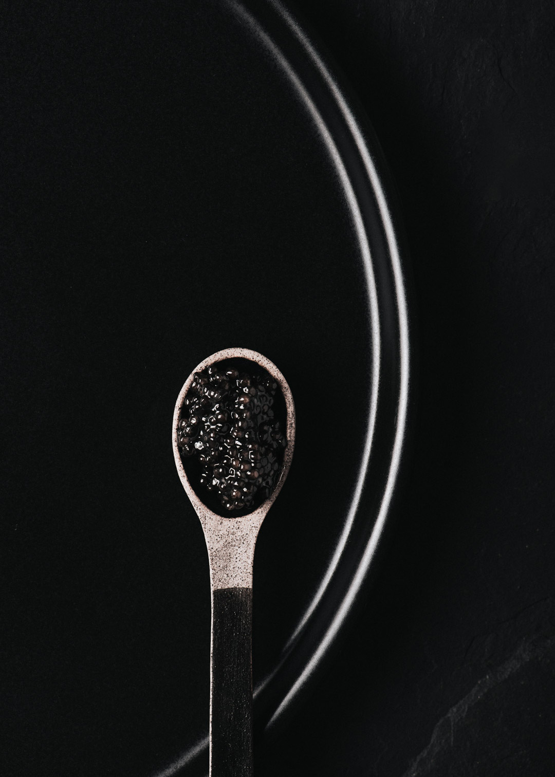
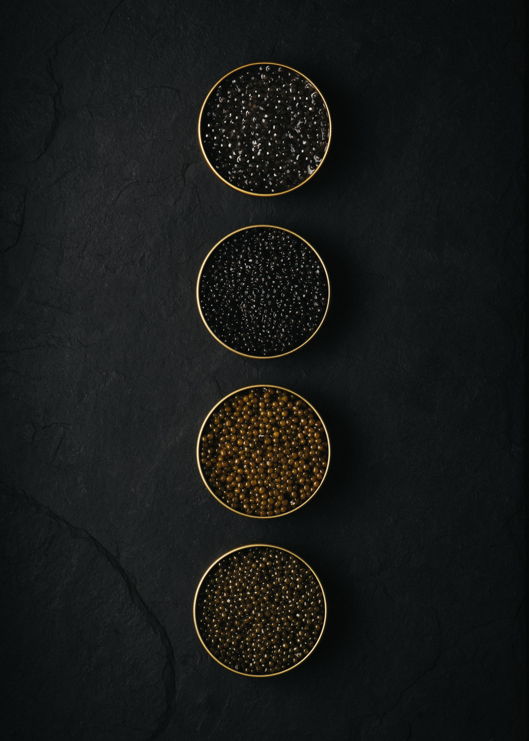
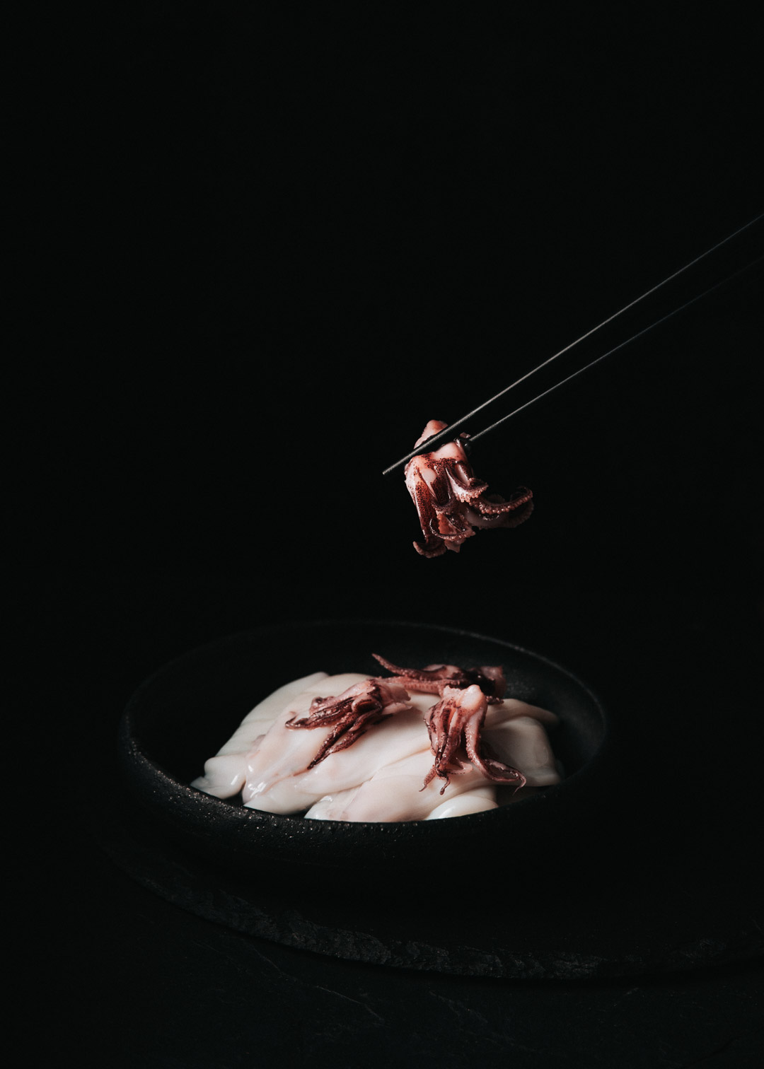
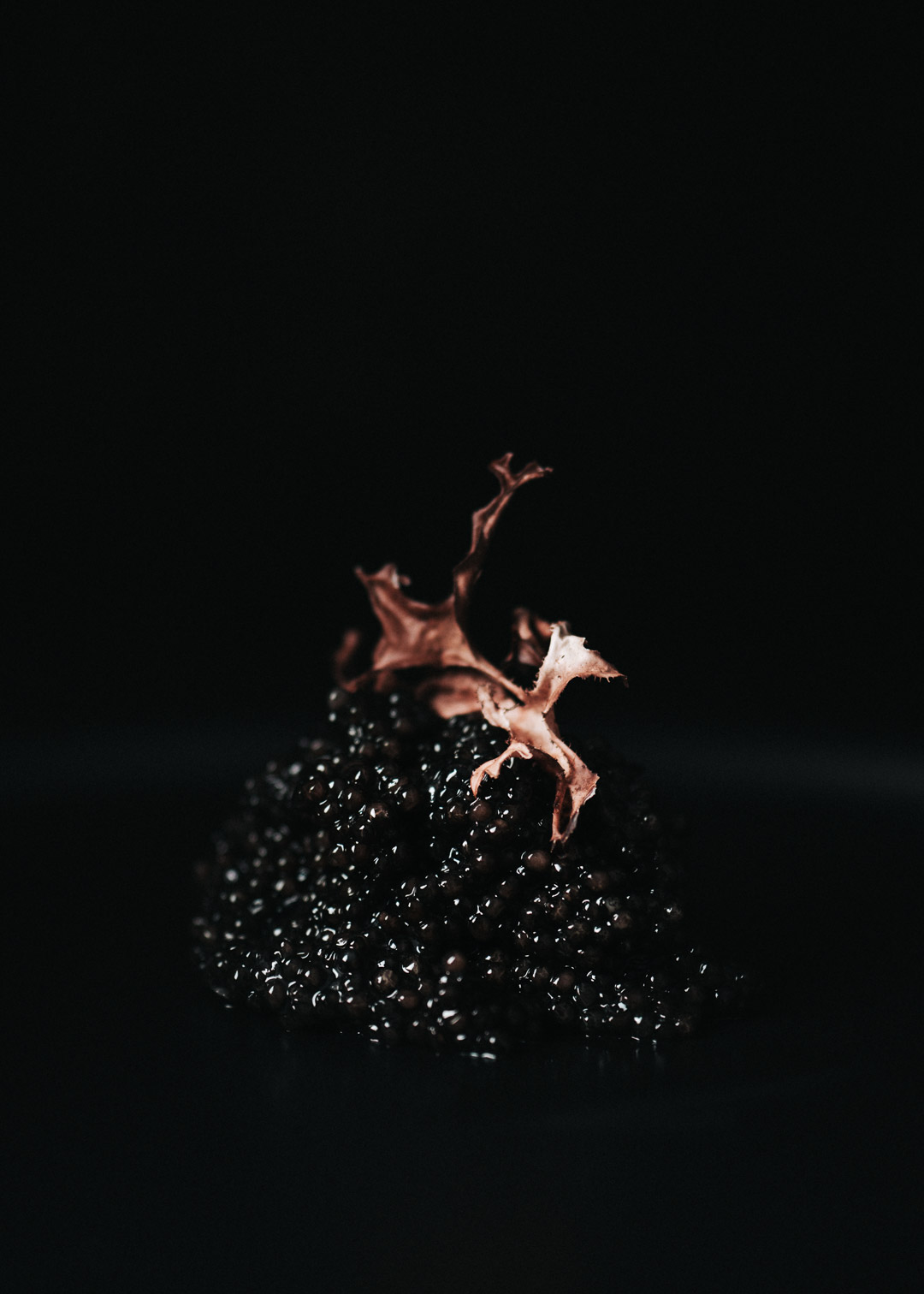
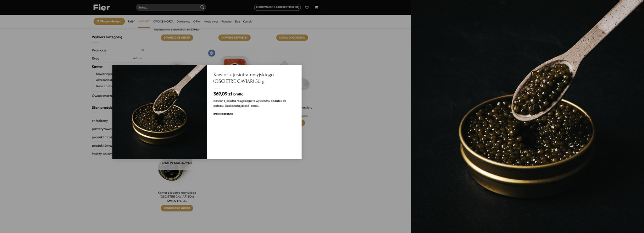
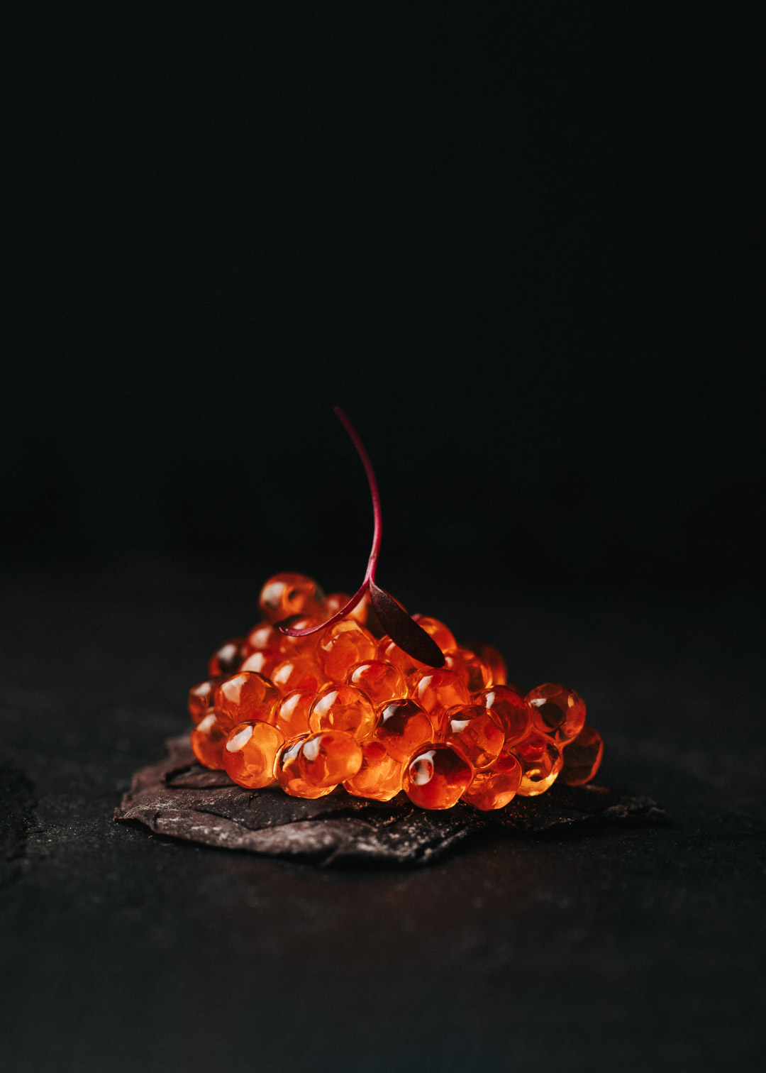
One of the central ideas I introduced was treating ingredients — particularly caviar and roe — almost like jewellery or sculptural objects.
Rather than photographing them purely as food products, I wanted them to feel rare, tactile, luminous, and precious.
This approach became one of the defining visual motifs of the series.
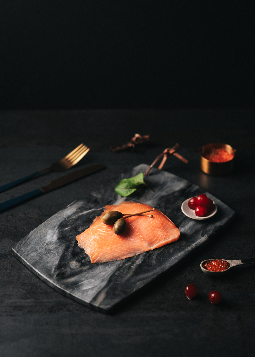
The imagery centered around contrast:
delicate ingredients against deep shadows,
organic textures against sculptural compositions,
precision balanced with imperfection.
Instead of overcrowding the frame, every element was carefully reduced to create tension, focus, and calm.
The visual language draws heavily from Nordic aesthetics — dark palettes, tactile materials, controlled cinematic light, and atmosphere over excess.
Making Ingredients Feel Precious
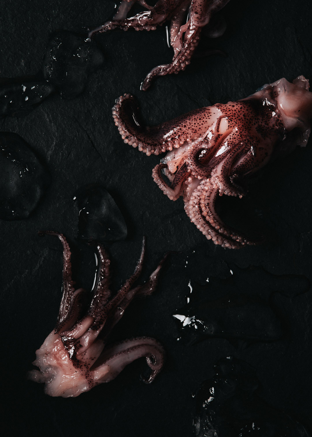
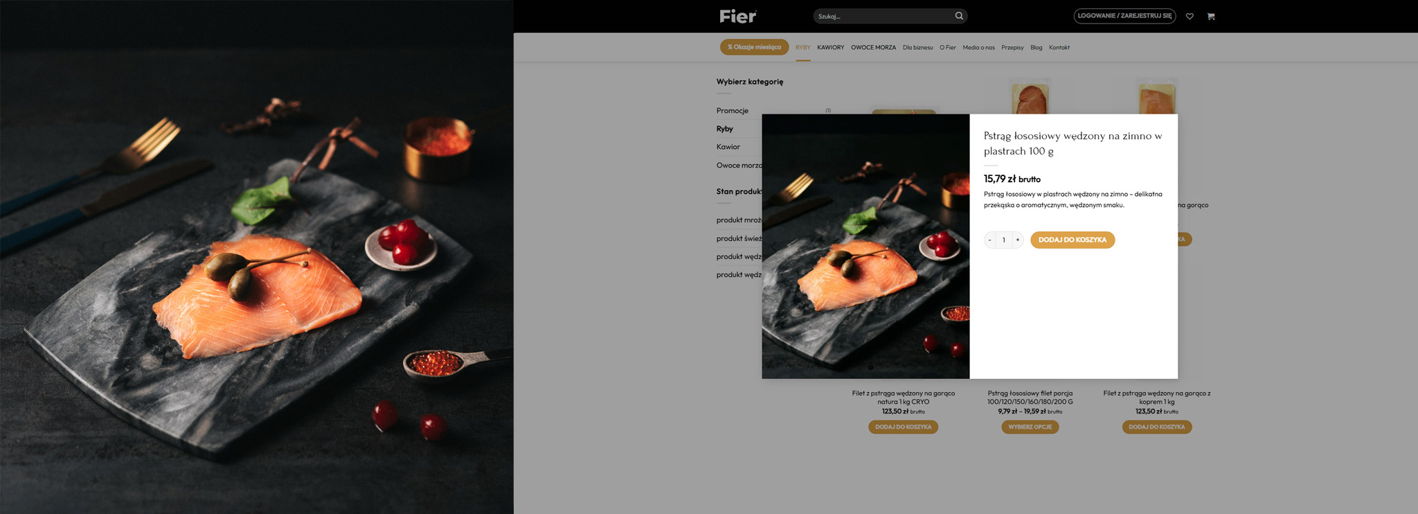
Seafood photography often leans heavily into freshness, abundance, and bright commercial presentation.
For Fier Seafood, I wanted to move in the opposite direction.
The goal was not to overwhelm the viewer, but to slow them down.
By isolating textures, simplifying compositions, and using controlled light, the products begin to feel more intentional and elevated.
More like objects of desire than commodities.
This quieter visual approach creates space for texture, atmosphere, and appetite to emerge naturally.
Building a Cohesive Visual Library — My Process
Over the course of several productions spanning multiple months, I created more than 100 brand assets for Fier Seafood.
All productions were executed remotely from my studio in Gdynia, Poland.
Seafood products were shipped directly from Spain to my studio in Gdynia, Poland, using temperature-controlled packaging, while the entire production process — from pre-production and visual direction to approvals and coordination — was managed remotely through video calls and ongoing communication with the agency team. The challenge was not only to create individual images, but to maintain a cohesive visual language across the entire body of work.
Each shoot expanded the visual world while preserving consistency in tone, atmosphere, texture, colour palette, and light.
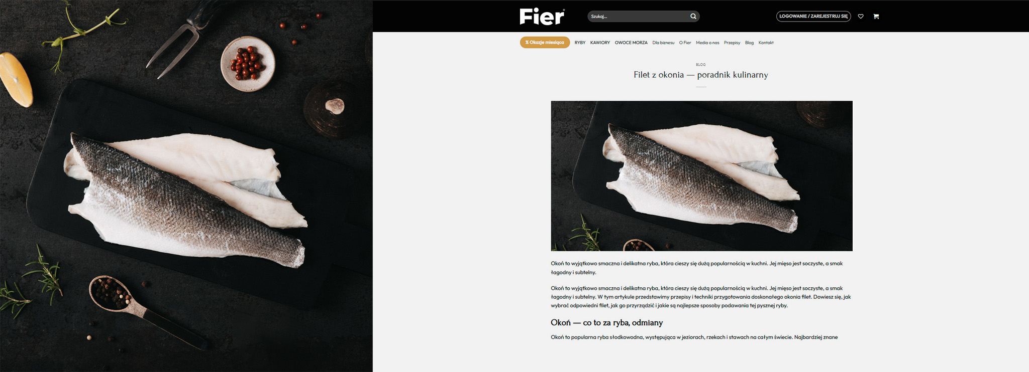
The imagery was implemented across the entire Fier Seafood ecosystem — including ecommerce, editorial storytelling, digital campaigns, social media, PR materials, restaurant catalogues, and trade fair applications.
Maintaining consistency across these touchpoints became a central part of the production process.
The resulting library gave the brand a flexible collection of assets for launch campaigns, packaging, digital communication, social media, editorial placement, and long-term brand building.
What interested me most throughout the process was creating imagery that could function commercially while still feeling restrained, tactile, and emotionally driven.
Imagery Across Touchpoints
The imagery was designed to function as a cohesive system rather than isolated campaign visuals.
From ecommerce and editorial storytelling to launch campaigns and printed materials, the visual language remained consistent across every touchpoint.
This consistency helped establish a stronger sense of identity and elevated the perceived quality of the brand throughout the launch.
Approach
Every image in the series was built through careful reduction.
Props, surfaces, colours, light direction, and composition were intentionally limited to create visual consistency across the project.
I’m less interested in creating louder images.
What interests me more is distillation — removing distractions until the subject begins to hold attention naturally.
That process of reduction became central to the Fier Seafood imagery.
The result is a body of work that feels atmospheric, restrained, tactile, and emotionally driven while remaining commercially functional for a modern premium food brand.
Creating Visual Worlds for Premium Food Brands
I collaborate with brands and agencies developing premium food products, and refined visual identities.
My work focuses on atmosphere, restraint, texture, and emotionally resonant imagery designed to elevate perceived value and create distinct visual worlds around products.
Available for selected commercial commissions across Scandinavia and Europe.